Introduction
There is a reason black and white abstract wall art keeps showing up in modern living rooms, bedrooms, and home offices. It is the style equivalent of a crisp white shirt. It makes everything around it look more intentional, even if your couch is from three apartments ago and your throw pillows were an impulse buy at Target.
I like it because it is simple. It does not scream for attention, but it also does not disappear. It gives your room structure. It makes your space feel cleaner, more modern, and a little more grown up, without forcing you to repaint the whole place.
In this guide, I will show you how to choose the right black and white abstract art, how big it should be, where it should go, how to frame it, how to avoid the too stark look, and how to light it so it looks good at night. We will keep it practical, friendly, and very USA apartment friendly.
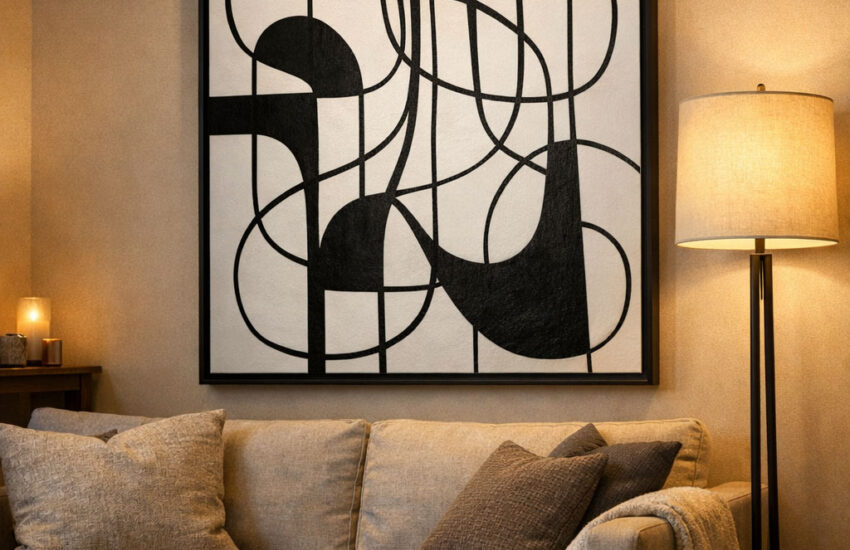
Modern living room with black and white abstract wall art
Why black and white abstract wall art works in almost any room
Black and white abstract wall art is basically visual balance. You get contrast without color chaos. That contrast helps a room feel more modern because the shapes and negative space read as intentional design.
What it adds to a living room
- A clean focal point above the couch or console
- Contrast that makes neutral furniture look sharper
- An easy way to tie together mixed decor, like wood, metal, and textiles
- A gallery feel without needing a full gallery wall
If you are starting from scratch, black and white wall art is one of the safest moves you can make. If you are updating an older space, it is the fastest refresh that does not require paint, new furniture, or emotional support.
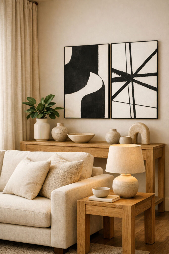
Does black and white abstract art work with warm neutrals like beige, oak, and cream
Yes, and honestly it looks better with warm neutrals than with cold gray rooms.
The trick is to pair clean black and white art with warm texture so the room does not feel harsh:
- Warm beige sofa or cream bedding
- Oak, walnut, or light wood furniture
- Soft textiles, like boucle, linen, wool
- Warm lighting, not icy blue bulbs
Think of it like espresso on oat milk. The contrast is strong, but the vibe is still soft.
Warm neutral room with black and white abstract art
This is the question that makes people freeze. Size is everything. The wrong size makes good art look awkward.
A simple rule designers use is the two thirds rule: your wall art or full arrangement should be about two thirds the width of the furniture below it.
Example
If your sofa is 90 inches wide, aim for art that is about 60 inches wide total, including spacing if it is a set.
Table: quick sizing guide for above couch wall decor
| Sofa or console width | Target art width using two thirds rule | What to buy |
|---|---|---|
| 60 inches | about 40 inches | one medium large piece or two prints |
| 72 inches | about 48 inches | set of 2 or set of 3 smaller prints |
| 84 inches | about 56 inches | one large piece or a 3 piece set |
| 96 inches | about 64 inches | oversized piece or wider gallery set |
The rule is a guide, not a law. But it is a great starting point when you do not want to guess.

The Two Thirds Rule For Wall Art
Is a single oversized piece better than a set of 3
Both can look amazing. The right choice depends on your room and your personality.
Single oversized black and white abstract wall art
- Looks bold, modern, and expensive
- Easier to hang, one anchor, one decision
- Best if you want a clean, minimal room
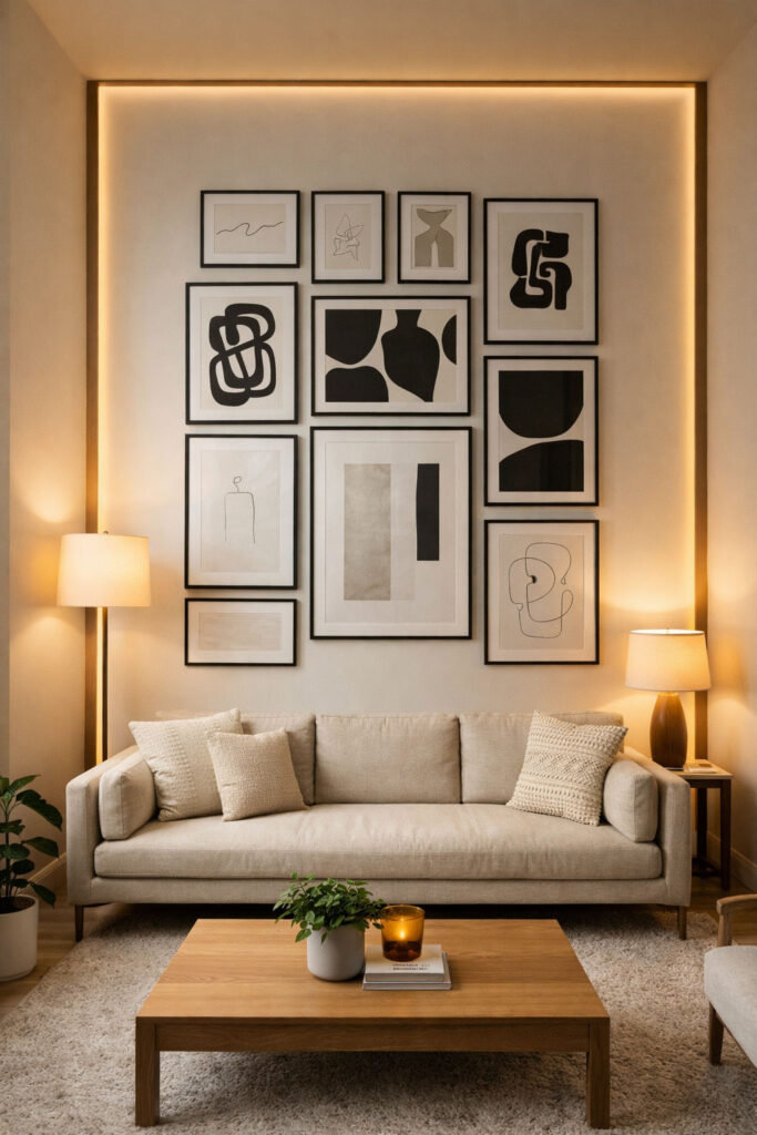
Black and white abstract wall art set of 3
- Feels curated and gallery like
- Great above a couch, bed, or long console
- Lets you control width and spacing
If you have a busy room, like a patterned rug or lots of bookshelves, a single large piece can calm it down. If your room is very plain, a set of 3 adds rhythm without adding color noise.
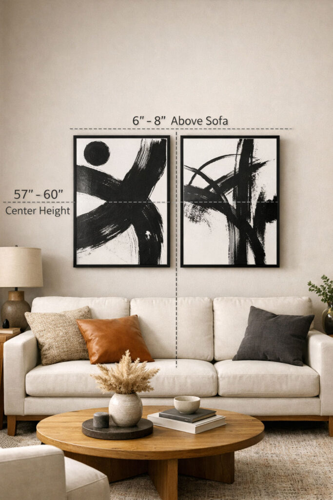
How high should you hang black and white abstract wall art
The classic guideline is the 57 inch rule: hang art so the center of the artwork is about 57 inches from the floor. This is used in galleries because it lands around average eye level.
When hanging art above furniture, you also want the piece to relate to the furniture. A common tip is to hang it about 6 to 12 inches above the top of the sofa or console, then adjust based on the height of the artwork.
My simple method
- Start with the center at 57 to 60 inches
- Then check the gap above the sofa
- If the gap looks too large, lower it slightly
Most people hang art too high. Your ceiling will survive. Your room will look better if you hang it lower.
Correct wall art hanging height above couch
Should frames be black, white, or wood for a modern gallery wall
Here is the honest answer: any of them can work, but they create different vibes.
Black frame black and white wall art
- The most modern and crisp
- Makes the art look bold and graphic
White frame
- Softer contrast
- Works well in bright, airy spaces
Wood frame
- Warms everything up
- Great for neutral, Scandinavian, or organic modern rooms
If you are building modern black and white gallery wall ideas, a consistent frame style looks cleaner. If you want a more relaxed feel, mix frames but keep them in the same tone range, like all light woods plus black.
Canvas vs framed prints, which looks more high end
It depends on your room, but here is the vibe difference.
Table: black and white abstract canvas wall art vs framed prints
| Type | Looks like | Best for | Watch out for |
|---|---|---|---|
| Canvas | modern, soft, casual | large pieces, minimal rooms | can look flat if print quality is low |
| Framed print | crisp, finished, gallery | sets of 3, gallery walls, polished look | cheap frames can look thin or shiny |
If you want the cleanest modern look, framed wins. If you want a softer, more relaxed look, canvas can be perfect.
How to mix black and white abstract prints with photos or line art
This is where your room can start to feel custom.
Try one of these mixes:
- Abstract plus black and white abstract line art prints
- Abstract plus black and white photography
- Abstract plus a single typography print, very minimal
- Abstract plus one textured piece, like a woven wall hanging
The key is to control the chaos with repetition:
- Repeat the same black frame
- Repeat the same white mat
- Repeat the same spacing between frames
What is the best layout for a gallery wall above a couch
Grid vs organic is basically neat vs playful.
Grid layout
- Best for modern, clean homes
- Great for sets of 3 or 6
- Easy to make symmetrical
Organic layout
- More casual and collected
- Works well if you mix photos and prints
- Needs planning, or it can get messy fast
If you are new, start with a grid. It is the easiest way to make a modern room look intentional.

Grid vs organic gallery wall layout
How to keep a black and white wall from feeling too stark
If your room starts to feel like a minimalist dentist office, you need softness.
Add warmth with:
- A textured rug, like wool or boucle
- Curtains in linen or cotton
- Wood tones, like oak or walnut
- Plants, one medium or tall plant is enough
- Warm light bulbs and lamps
Also, choose black and white abstract art that has some gray tones or brush texture. Pure black ink on pure white can look intense. Soft gradients and texture are easier to live with.
What lighting makes black and white art look better at night
Bad lighting can make art look flat. Good lighting makes it look like a feature.
If you use spotlights or ceiling lights to highlight art, a common recommendation is to aim the light at about a 30 degree angle to reduce glare and bring out texture, especially behind glass.
Easy ways to light your wall art at night
- A picture light above the frame
- A nearby floor lamp angled toward the wall
- A warm table lamp that bounces light across the room
You do not need museum lighting. You just need the art to catch a little glow.

Art lighting setup at night
Affordable black and white abstract wall art shopping shortcuts
If you want affordable black and white abstract wall art, focus on these points:
- Go larger than you think, small art looks cheaper on big walls
- Choose consistent framing, it looks more premium
- Pick art with texture, brush strokes, or subtle gradients
- Use the two thirds rule for sizing so the wall looks balanced
FAQ quick answers
What does black and white abstract wall art add to a living room
It adds a clean focal point, modern contrast, and a polished look without needing new furniture.
Does black and white abstract art work with warm neutrals
Yes, it looks especially good with beige, cream, and wood tones because the room stays warm.
What size wall art should I choose for above a sofa
Use the two thirds rule as a starting point, aim for art about two thirds the sofa width.
Is a single oversized piece better than a set of 3
Oversized is bold and simple. Set of 3 feels curated. Choose based on how clean or layered you want the room.
How high should I hang it
Start with the center around 57 to 60 inches from the floor, then adjust for the sofa gap.
Black, white, or wood frames
Black looks sharp and modern. Wood warms it up. White softens contrast. Match your room tone.
How do I keep it from feeling too stark
Add texture and warm lighting, and pick art with soft gradients and brush texture.
Canvas vs framed prints
Framed looks more finished and gallery like. Canvas looks softer and more relaxed.
What lighting makes it look better at night
Use a picture light or angled lamp. A 30 degree angle helps reduce glare and adds depth.
Conclusion
Black and white abstract art is the cleanest way to modernize a room because it does one job really well: it makes your space look intentional. If you follow three rules, you will get it right almost every time:
- Size it using the two thirds rule
- Hang it at a comfortable viewing height, not too high
- Warm it up with texture and lighting